A passionate designer and an experience innovator constantly in motion, learning and trying new things. Pixel perfection is my mindset since I am obsessive about details. I am a self-starter able to begin projects and see them through to completion. I also enjoy teamwork because I value communication and collaboration.


EVB (Evolution Bureau) is an advertising agency based in Oakland. They help other companies – Facebook, Twitter, Jameson, etc. – with their branding. EVB is identified with the color green and a logo comprised of leaves growing within a circle. I got a chance to do their website rebranding as the lead designer in a five-person group.
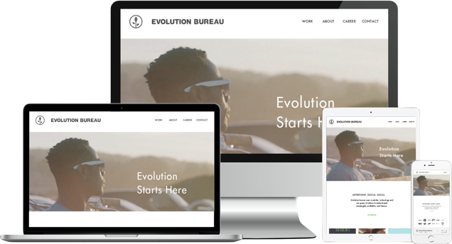
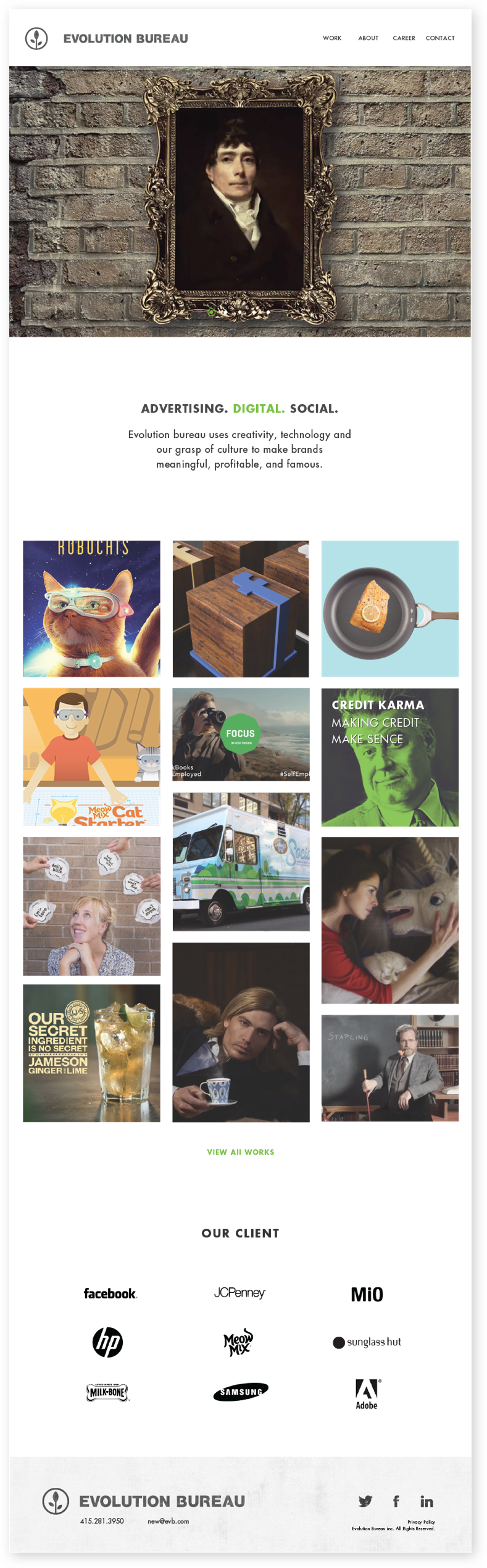
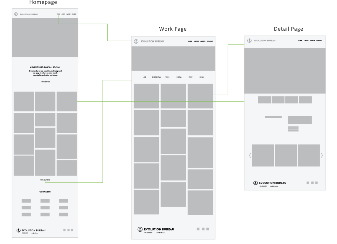
For redesigning and relaunching EVB.com, we were asked to explore look and feel of the website, create UX wireframess, and design comps. Our goal was to give birth to a new and engaging website that helps connect EVB to it’s potential clients and employees.
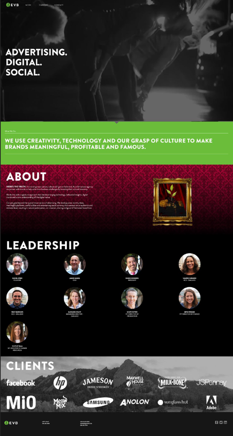
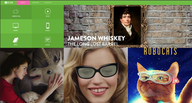
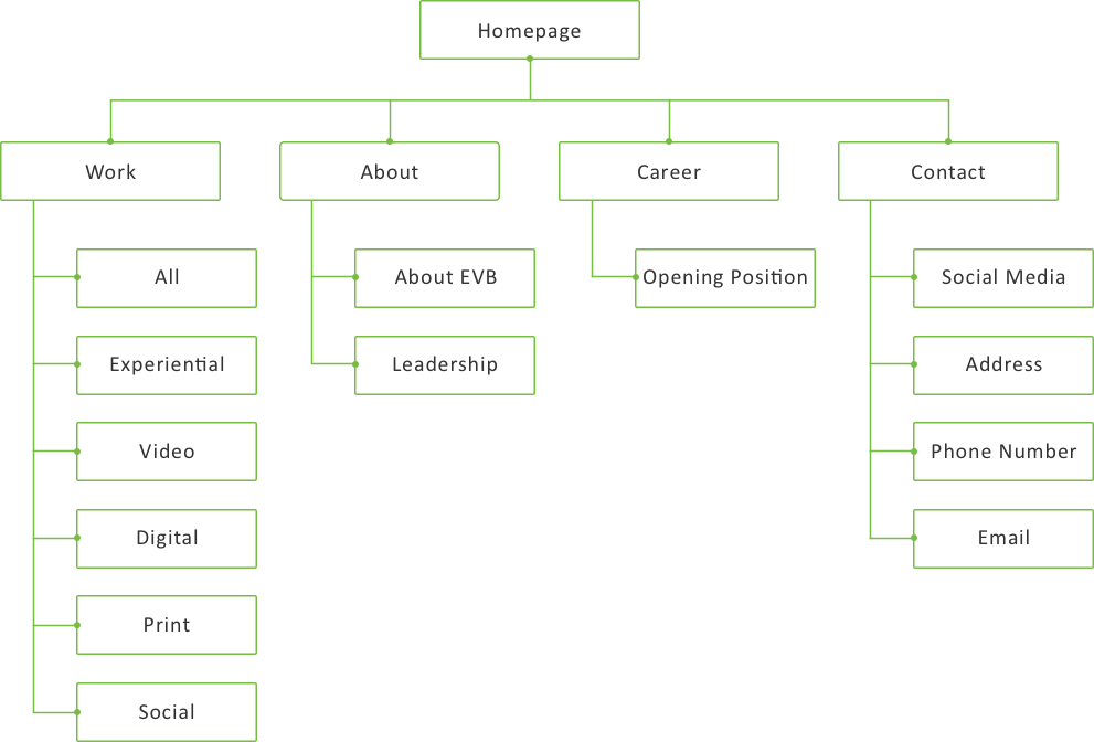
EVB’s brand is about evolution, however, their previous website was a little out of date. The color green was a little distracting. The sidebar menu on the work page had an unclean feeling towards the page.
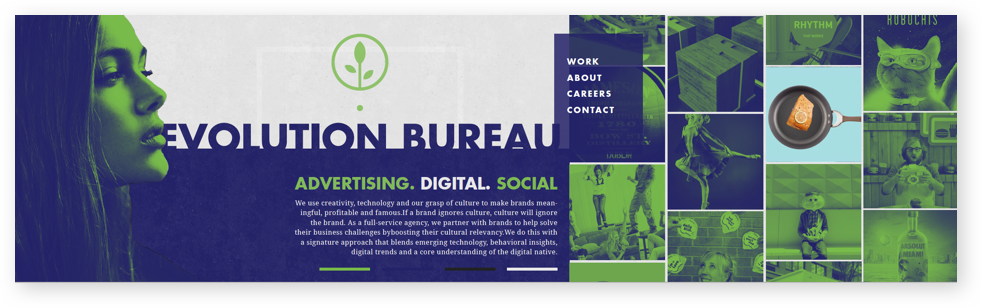
The solution was to bring consistency to EVB.com – to redesign the website with a younger and newer feel by using minimal color, an organized workpage, and keep it consistent with their own branding.
We did 3 rounds and 2 directions for color and style explorations. We kept on trying new things based on the feedbacks of the EVB creative team. Here are some stylescapes in progress, check the case study above to know more detail of our design process.
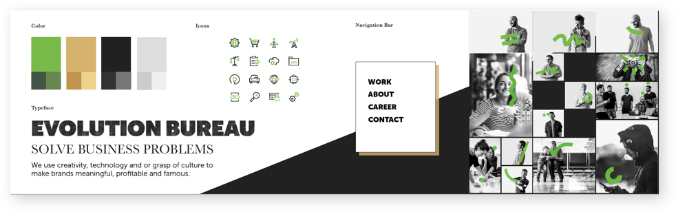
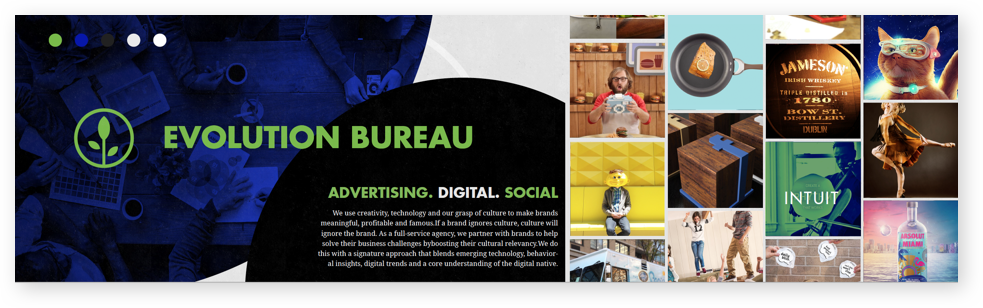
The agency preferred to be known by their full name, not just EVB. So we used Evolution Bureau as the logo mark besides the logo with the same texture for their website.


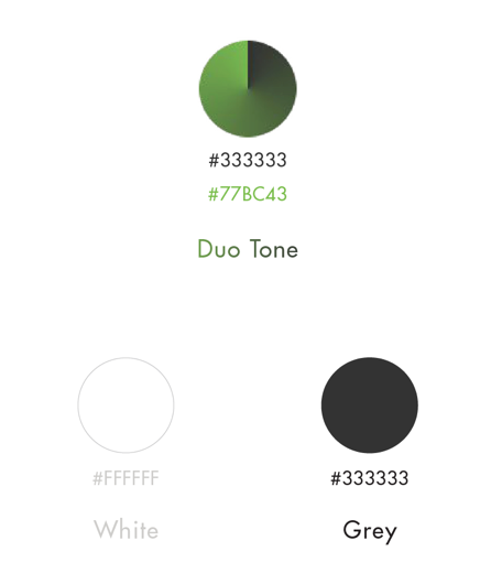
We didn’t use a lot of their primary green color since we would like to keep the webpages simple and clean. Instead, we added a little bit touch of the duo tone when hover on the work thumbnails to make the website more fun and playful.

We had to make certain adjustments and tweaks in order to convey a proper image. We did as many tests as we could within the given timeframe and eventually came up with a lighter, simplier version of EVB’s website.